
AIML.com Website Redesign
Overview
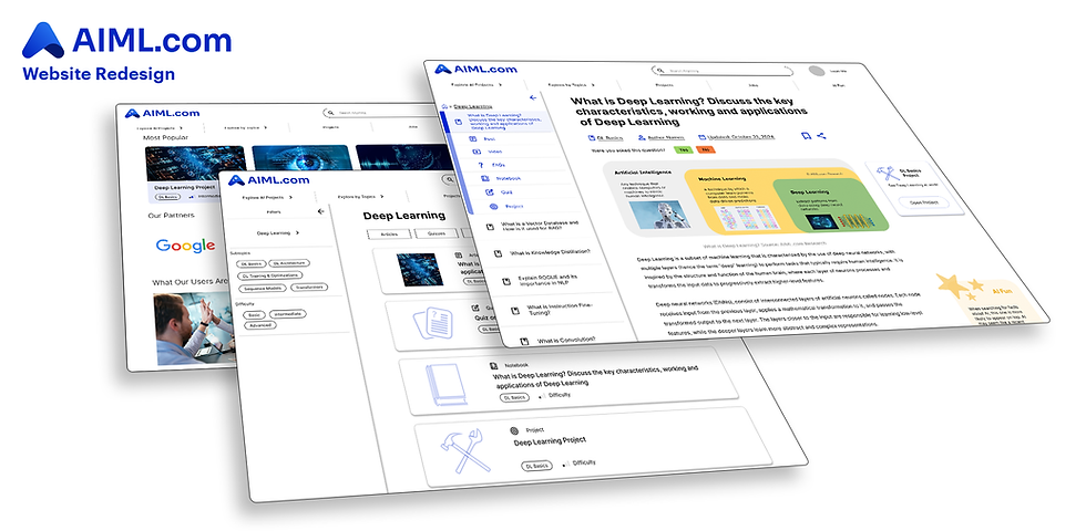
AIML.com is a website that post interview preparation materials for job seekers in the field of machine learning. During my internship with AIML.com in Summer 2025, I redesigned the website to deliver a friendlier navigation experience.
My Role
UX Design Intern
-
Created mid- to high-fidelity Figma prototypes
-
Improved website navigation
-
Redesigned article pages with decluttered layouts and modern styling.
-
Added a promotion page to highlight featured paid content, aligning with the site’s business goals.
Article Page
Before and After
Demo

Initial Examination
The first step I took is to look for opportunity for improvement in the current article page.

Redesign
The redesign addresses these issues.

Navigation Bar
As the most important improvement of the article page, the new navigation bar reduces clutter and emphasizes relevance. Instead of displaying every topic, it highlights those most connected to the current page while keeping distant topics hidden. This helps users focus on what matters, while clearly showing the current page’s category and related materials.
Before

After

The new navigation bar can also be collapsed, while the article page enters a focused view, giving users a distraction-free learning experience.

Data Driven Design
This design of navigation bar is selected as a result of rigorous user research. After discovering the information clutter issue in the current navigation bar, I devised several possible redesigns, each experimenting on a different row height, indentation scheme, or number of hierarchical levels. These designs are then given as options in surveys sent out to the users. As a result, the users show consistent preference on this particular version of the navigation bar.


Index Page
Given the vast amount of content on AIML.com, I recognized that a key factor in user satisfaction is how quickly visitors can find relevant material. The existing index page only listed titles under each topic, with minimal search, sort, or filter options, making content discovery slow and frustrating. Inspired by leading online education platforms, I redesigned the index page with a modern look and a robust filtering system. Users can now narrow results to just a few relevant entries instead of sifting through dozens, reducing cognitive load. The new index also unifies articles, quizzes, and projects under a single system, replacing the fragmented approach of separate indexes for each content type.
Before and After
Demo

Data Driven Design
In user surveys, I showed several designs of the index cards, which display key information on a piece of material. I compared 1 vs. 2 column layouts, and spacious vs. compact layouts. Eventually, the users prefer a single-column and compact layouts.


Project Sales Page
As part of its business strategy, AIML.com plans to make practice projects its primary revenue source while keeping articles and quizzes free to attract users. For my final internship task, I designed a project sales page dedicated to promoting projects. Though the index page also lists projects, the sales page highlights best-sellers and provides a tailored browsing experience. Placed at a prominent position, the page will help AIML.com quickly stand out from competitors.
